|
I have created a logo for myself as I was not able to think of a specific brand. The logos that I made is based on my initials C and K. I have chosen the most simple but friendly (?) looking logos. I chose the first logo I have designed because I liked the flower borders and the CK as a calligraphy. It looked both simple and pretty. The second logo was chosen as I liked the simple look of it. The third one I have chosen is the long CK one, the fourth one. Again, I really liked the simple look of it. I don't really like the pillar one as it kind of is weird and though I have tried to make it to communicate the truth and trustworthiness of the company it ended up looking a bit awkward. Another logo I didn't really like is the borders that are not connected like the ones in the second row sixth and seventh. The final logo I didn't really like is the last one in the first row. I didn't really like it maybe because of how I drew it but also because it looked a bit sophisticated. I liked the process because I was able to show my creativity and push myself to think of more ideas. Things that were challenging about the process was the adjectives to describe my logos, in the end I had to think and push myself more and more. Overall, it was a new experience and I had fun designing and showing my creativity and create a lot of varieties of logos.
0 Comments
Colour theory is a very important element in graphic design. It gives the viewers the message behind the design, both on psychological and visual way. During our time in virtual school, we learned about colour theory. We had two assignments to complete, Colour Names and Colour Schemes. For the assignment, Colour Names, our assignment was to find the hex code and the RGB code for the colour we have picked. For this assignment, I have used basic shapes with different shades of the rainbow (one normal and another pastel) to make this design. I think the challenging part of this assignment was how I had to think about the CRAP design principles along with the actual design. I overcame these challenges by using the 'supporting lines'. But in the end, I was proud I have overcome these challenges and made a design that also considers the CRAP design principles. The next assignment given to us was the Colour Schemes assignment. Also for this assignment, I have used basic shapes and many different colour to do this design. This assignment we had used the website Adobe Colour to find the colour scheme of specific themes such as, triadic, monochromatic and etc. Some challenges I have faced in this assignment was again the CRAP principles and also thinking about how I can fit everything in the page. I overcame these challenges by again using the 'supporting lines' and making things smaller and bigger. In the end, I was proud that I was able to use the CRAP elements to make a design that I am pretty proud of. Colour Names 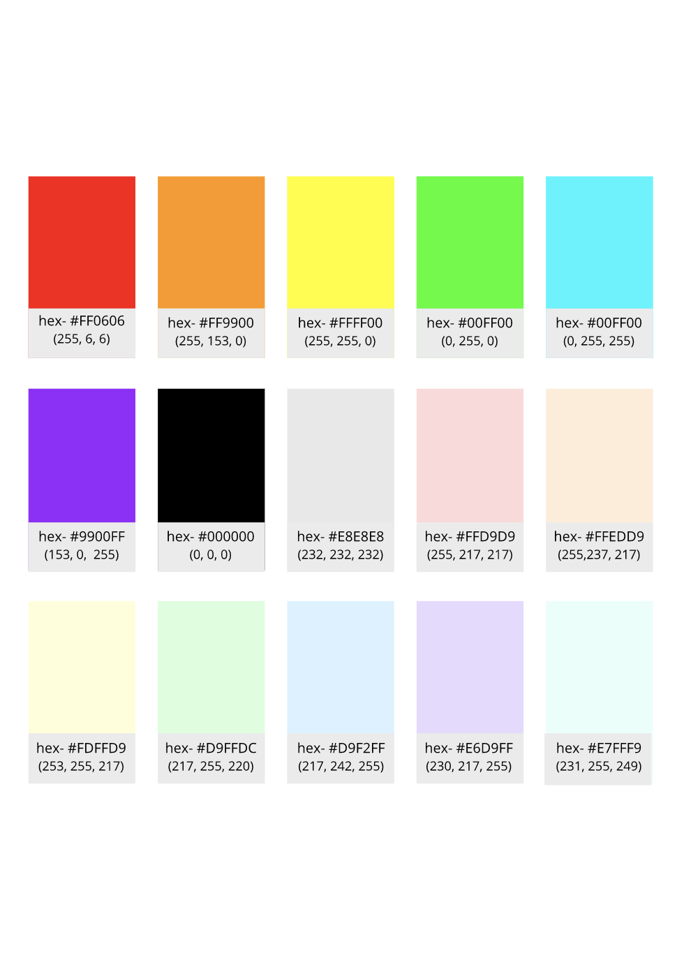 Colour Schemes 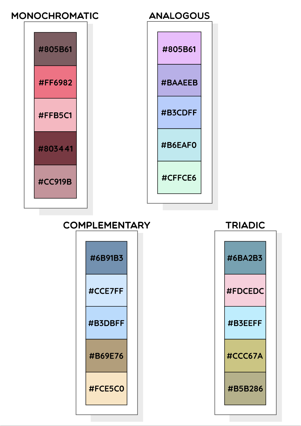 Typography is the visual component of the written word (- M.Butterick). It is also described as fashion for words (?). Typography is important as it gives character and attention to the writing. Each font has a personality and purpose. This means that each font has a specific use and character in it. For example, Comic Sans. Comic Sans was originally used for a Microsoft game, soon it was much used for for children as it is fun and easy to read (for children), soon after many important places such as hospitals, police offices and warning signs were using it. If people know the character and purpose of this font, people can use it for more appropriate places not warning signs. There are five different types of font that we learned in class. Serif, Sans Serif, Monospaced, Handwriting/ Script and Novelty. Serif has "feet" at the bottom it is mostly used in formal events. Sans Serif do not have "feet" at the bottom and it is much better for a child use. Monospaced words have equal amount of space and it is used in coding. Handwritten or Script fonts include calligraphy, cursive or handwritten. Finally, Novelty fonts are the fonts that are not in the 4 other categories. They are fun and used in fun events, like a birthday party. Typeface Comparison For this assignment, I was able to find different types of fonts and learn about the five main types of font-- Serif, Sans Serif, Monospaced, Novelty and Handwriting. I also had to consider about the CRAP design principles. Though I did have a slight hard time on working on the CRAP design, I was able to get approved by Ms. Kosmack after a few trial and errors.  Word Portraits This assignment allowed me to again, practice my CRAP design principles but it also allowed me to have a better understanding on appropriate fonts in appropriate events. Though it did again took some trial and errors I was able to improve my principles on CRAP. I also found out how to import fonts on Gravit  In these few lessons, we learned about using the pen tool in Gravit. We first worked on the heroes document where we learned to use the tool, then the penny exercise where we cut out Abraham Lincoln's head and then we worked on our summative where we made our own picture using the pen tool. The pen tool is a handy tool that can cut out shapes by using a pen or a bezigon. For my summative, I made a picture of a girl finding a 'special' flower. (I put the links below the image). Some challenges I have faced is to get it accurately and on the guidelines. It did take some time to get use to the tool but in the end, I was able to use this pen more fluently because I kept practicing using it. 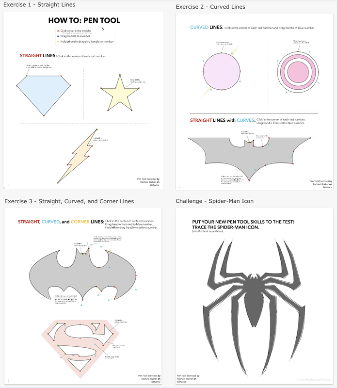  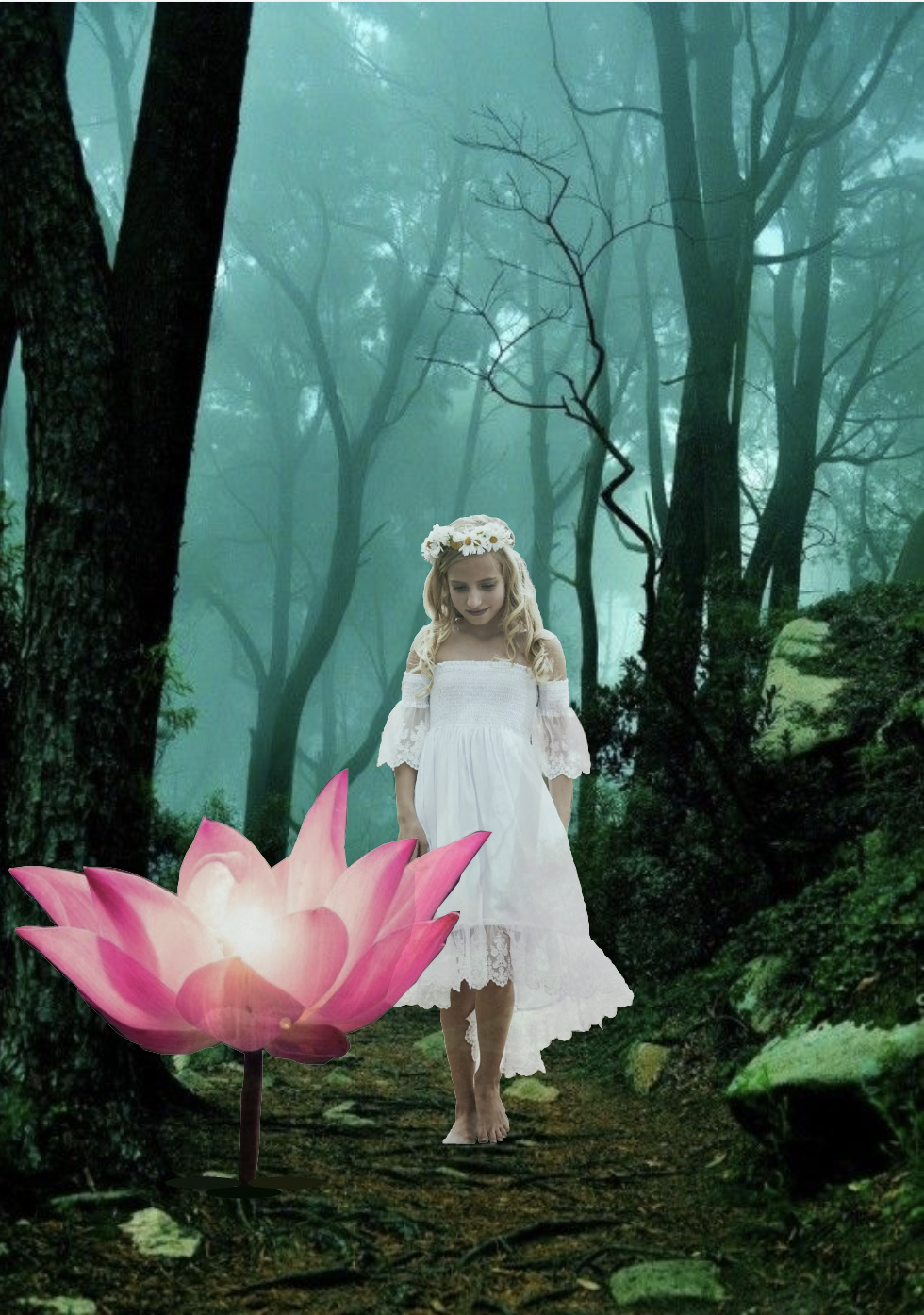 During the lessons on the Hour of Code, I have learned many things. In the beginning I was pretty doubtful if I would be able to do this but in the end my drawing came out pretty well (better than I have thought). I was able to make circles (ellipses) for heads, triangles for the body, arcs, lines, rectangles for the body etc etc. I learned how I can make a shape have no stroke ( noStroke(); ) and how to fill in the background colour and shapes. This drawing is a picture of my family (my dad, my little brother, me and my mom). This was a new challenge as I had to do the head, body, background all with codes.  Code for my drawing
In this summative, I used many different techniques I have learned such as, the clouds, I have made a compound shape, and for some shapes I have made it into a path. This picture is meaningful to me because this Chuseok we went to Danang Intercontinental. Our family made very meaningful memories together so I thought this picture would be good to draw/ make. 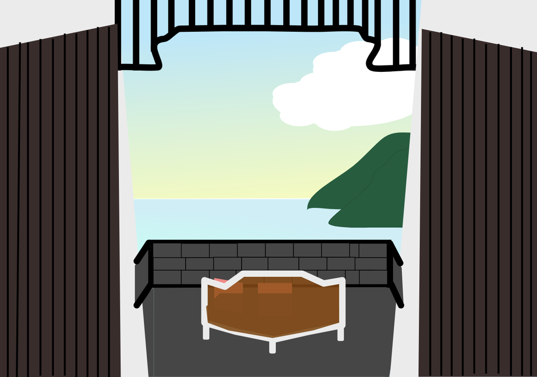 In this lesson I have learned many different techniques when editing shapes. Now I can crop it in unusual/ unique ways and join two shapes together. This lesson has also reminded me how to round shapes.  In this lesson, I have learned to change borders into different styles and fill in colour onto shapes. I also learned to change the opacity. Though it was overdue, I did learn a lot of helpful information I can use later on  in this lesson, I learned to align shapes by grouping. I learned important techniques in graphic design such changing layers in the beginning it was confusing and sometimes hard but as I did more of it, got easier and I understood it well. 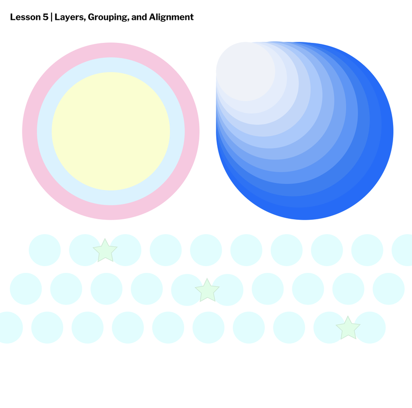 Creating this work, I learned many things such as converting a shape into a pathed shape, switching between sub-select tools and pointer tools, learning what type of thing pointer can do and I learned how to use the sub-select tool in order to make the shape I want. Also I learned to fill in the colour of the shape or the line.  |
Archives
April 2020
Categories This work is licensed under a Creative Commons Attribution-NonCommercial-NoDerivatives 4.0 International License. |
